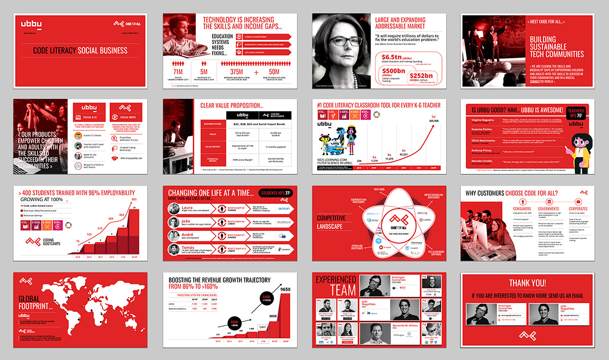
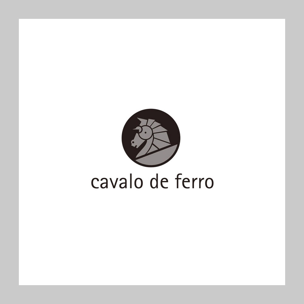
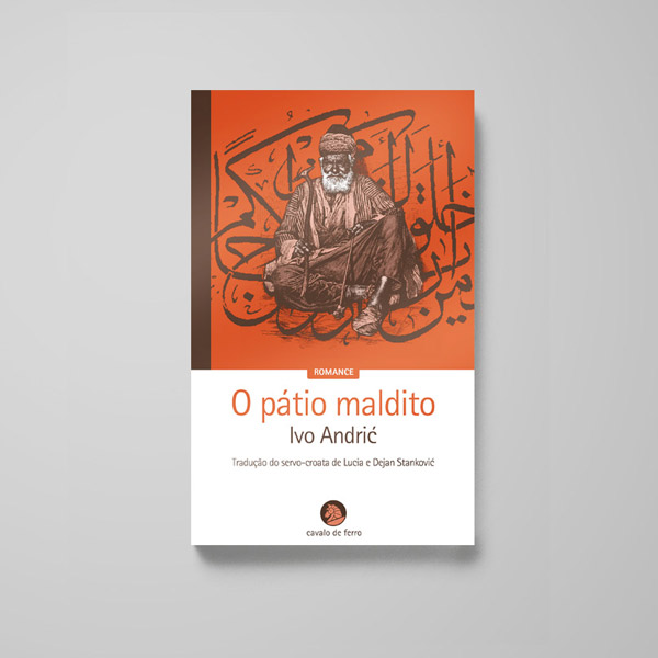
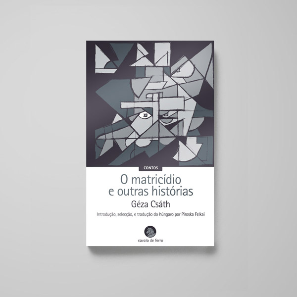
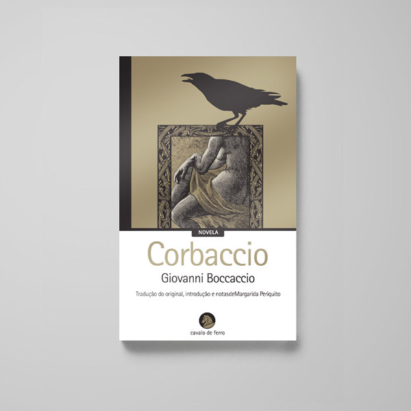
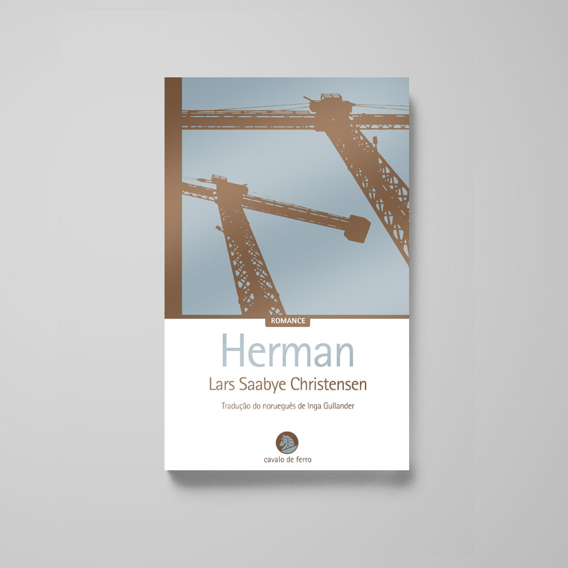
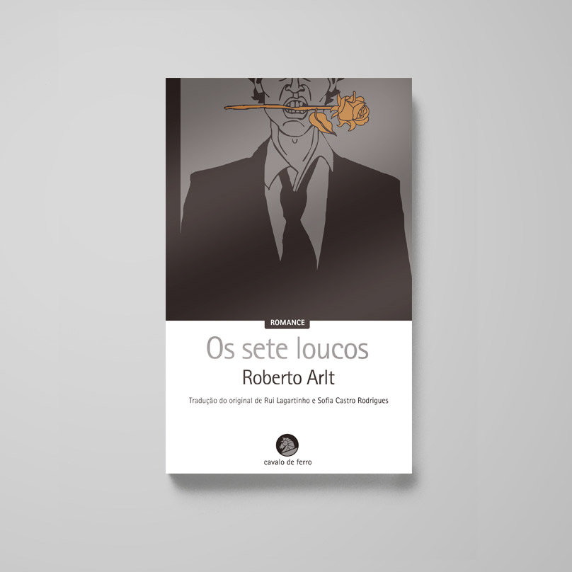
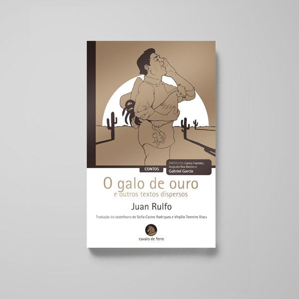
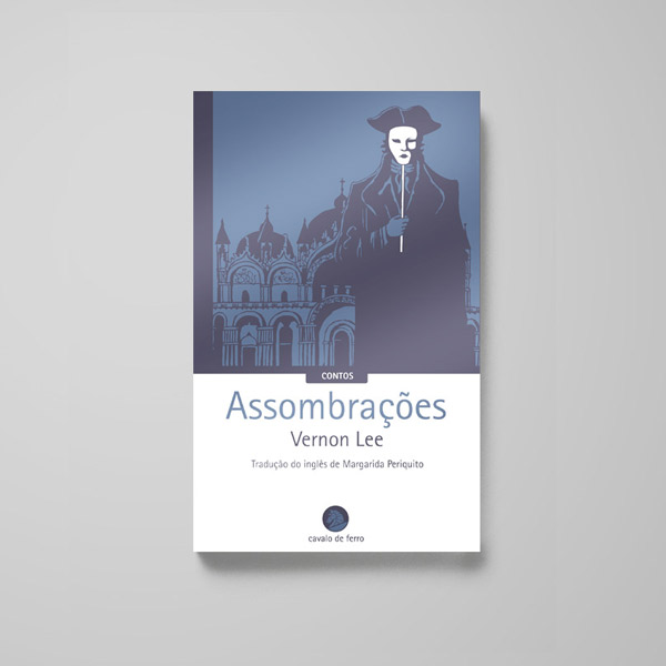
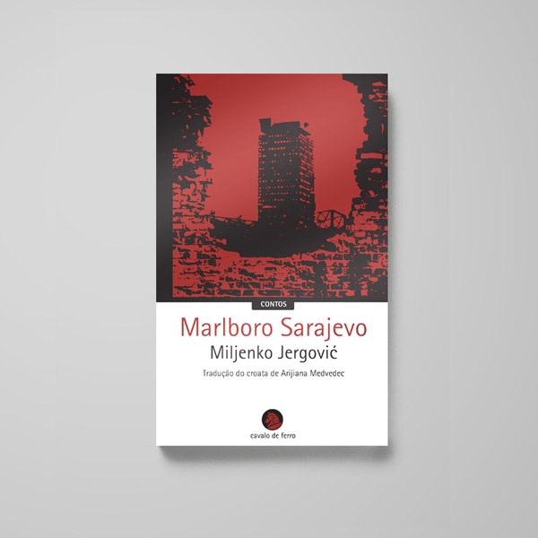
We were approached by Cavalo de Ferro, a new portuguese publishing house that was focused on the work of excellent, yet less known writers.
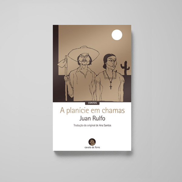
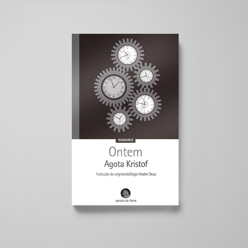
The callenge was to create a brand that stood out as premium, and to create a collection that was immediately recognizable on a busy book stand. All on a tight budget.
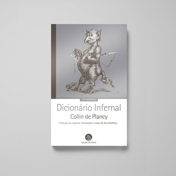
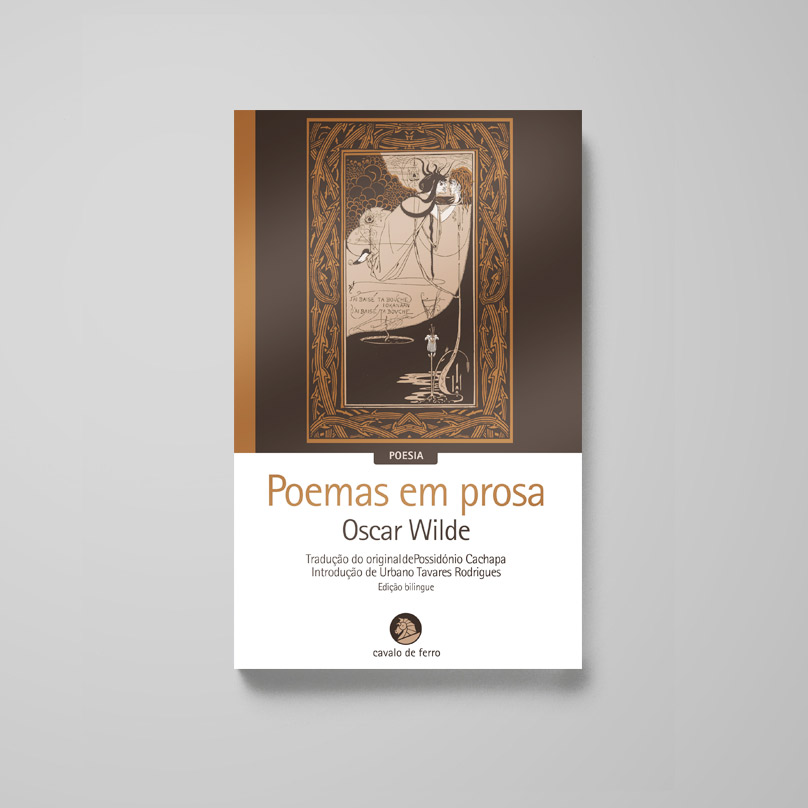
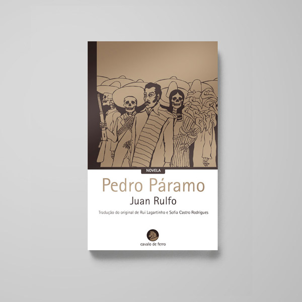
The solution was the creation of book covers that used only two mettalic colours, which meant low production costs with a premium look, and a coherent design structure. The colours not only related to the brand (“Cavalo de Ferro” translates as “Iron Horse”), but were quite eye catching on a book stand.